Lisa, an old friend from back in high-school, contacted me to explain that she was currently developing her logo skills as a graphic designer, and that she had some great ideas for the blog. She is, at present, working towards becoming a full-time freelance designer - and you can see more of her work here: http://www.behance.net/Lisa_Dicks
I jumped at the opportunity, and after agreeing on a package and what I required, the project began! She started the process by asking a bit of background behind the blog and the sort of personality I wanted to communicate, allowing her to visualize some designs. I explained that I didn't like things that looked too straight and perfect, and rather preferred a more messy, nonchalant feel (I think, growing up in Dubai, you get tired of perfect buildings, straight lines etc - let's have some messiness and disorder!)
I jumped at the opportunity, and after agreeing on a package and what I required, the project began! She started the process by asking a bit of background behind the blog and the sort of personality I wanted to communicate, allowing her to visualize some designs. I explained that I didn't like things that looked too straight and perfect, and rather preferred a more messy, nonchalant feel (I think, growing up in Dubai, you get tired of perfect buildings, straight lines etc - let's have some messiness and disorder!)
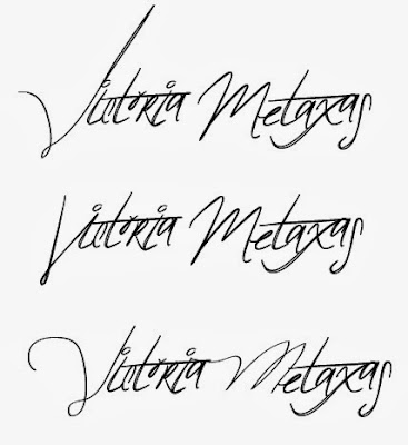
So the first step was to choose the font. Funnily enough, I sent her through one that I had found, and it turned out that she had already picked it as one of her options - she read my mind, clearly a great designer! Honestly speaking, it is one of the most difficult things for one person to bring to life another's ideas, so the fact that this was done between Dubai and South Africa says a lot about her skills!
And I decided upon this awesome one:
From the font, she moved onto stylising and kerning the logo, making it more unique so it would tie to my brand. I also wanted a VM shortened version, to be able to watermark my images without the whole logo. So, by hand, she enhanced those two letters to make sure they stood out.
Once I was happy with the font and the overall look, we chose a colour palette that I thought was suitable. Feminine, but elegant, I went for a cornflower blue as the main shade.
And soon enough, the logo began to take shape...
With a final outcome that I absolutely love!!!
Lisa was great throughout the entire process. Whether suggesting ideas, or ensuring all my changes were taken into account, it really was smooth-sailing.
If you need a new logo designed, or just simply want some creative advice, you can find Lisa's contact details below:
If you need a new logo designed, or just simply want some creative advice, you can find Lisa's contact details below:
Email: Lisadicks@gmail.com
Mobile: +27 (0) 79 867 8691
Website: http://www.behance.net/
Website: http://www.behance.net/

.jpeg)


Thanks! Will do :) You can follow me on Facebook here if you'd like - www.facebook.com/victoriametaxasphotography
ReplyDeleteAw thank you Marta!!! Yes :) Would love to - what is your Facebook? You can follow me here at www.facebook.com/victoriametaxasphotography or on Bloglovin' at http://www.bloglovin.com/blog/9271093/?claim=mw3jq97hudz
ReplyDeleteLovely blog ;)
ReplyDeleteyou have a lovely blog <3 love the logo, it's so cute!!
ReplyDeletefollow?
http://stormia-fashion.blogspot.com/
kisses ;)